MomijiYama Studio Branding
2022.12
Musical Studio Mini-Branding
Designer:
Zack
2022.12
Musical Studio Mini-Branding
Designer:
Zack
This is a branding project for HarmoriX's personal music studio. He was interested in the maple leaves, and based on his music style of an Asian based modern music, I designed the following system for him. This is a mini-branding, for there are cases like this that, the customer does not have enough time or budget, or either he would reduce the amount of work for me, so this is not that much a whole-scaled thing, but hopefully he likes it.

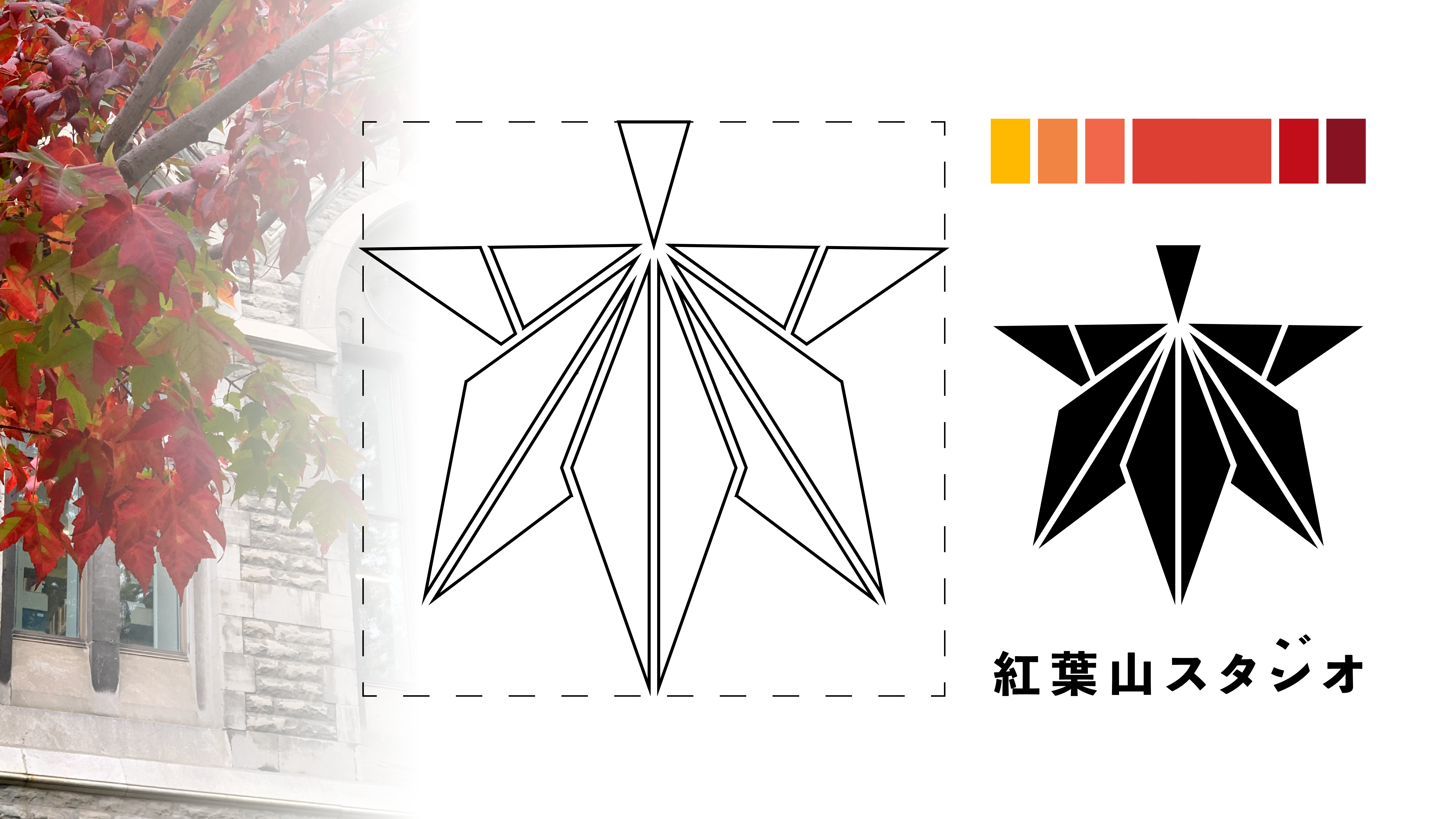
The finalized logo/Artboard
The Design:

The Final 2 color outcome:
This might be an important component for him as he has this pursuit in a Japanese style;

The two color Flag/Board design
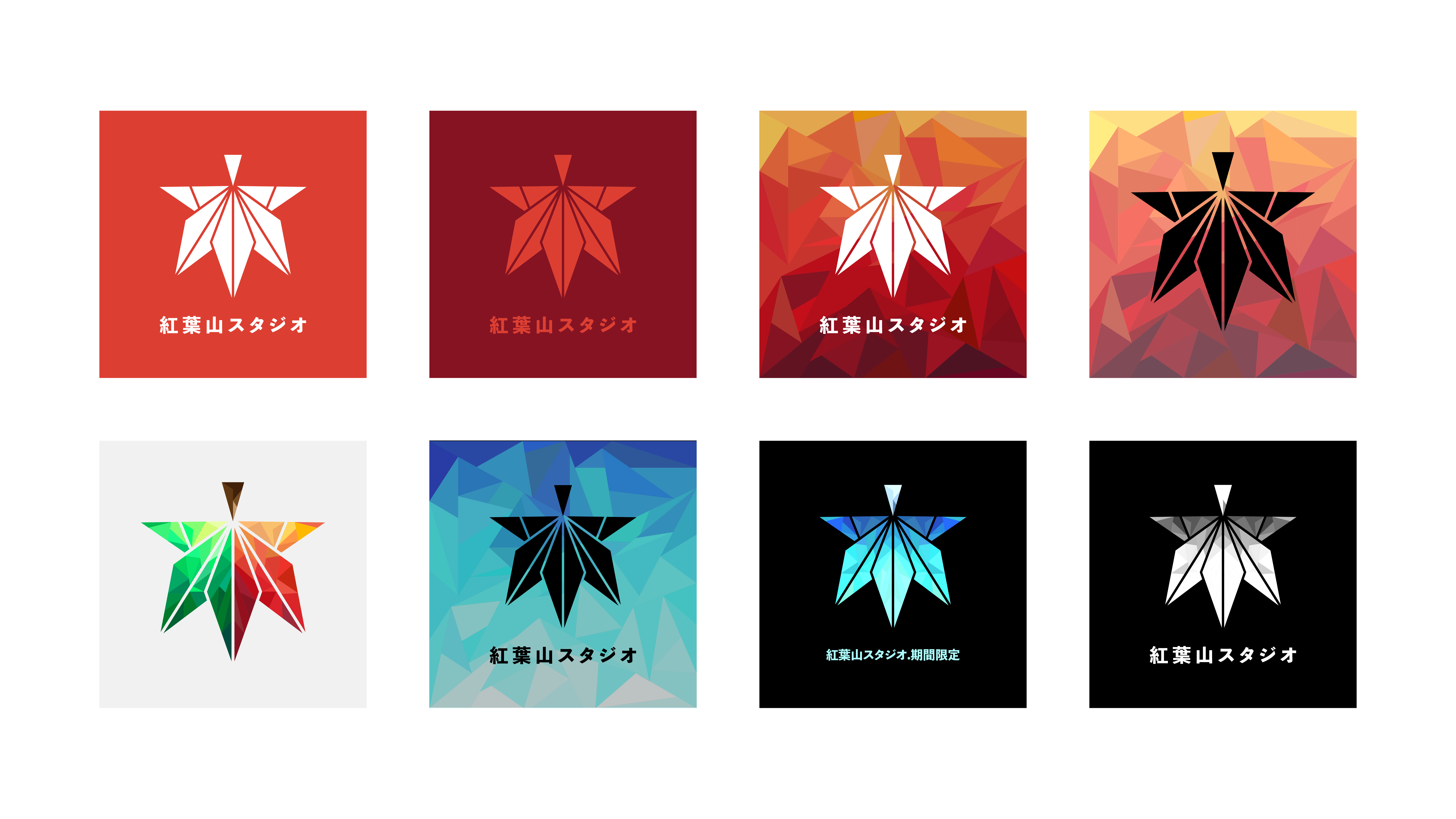
The Gradient Variation:
The Leaves are not always red. They are not staying at one exact color permanently, so I think cutting out some shapes in the logo so that the leaves may have their own “shifts” could be a cool solution. This outcome works better at some visual based promotions.

The Albums:
As the leaves may change, I know that my friend may have different needs for different songs. This can be also affected by the time he’s making his music (say if that’s winter time, or if it’s a really grief event based work…) I’m making some cover variations for him.

Back to Top
Our Other Projects: